Stop Learning Animations First: Learn Layout Like Premium Agencies
Tejas GK| (3mo ago)
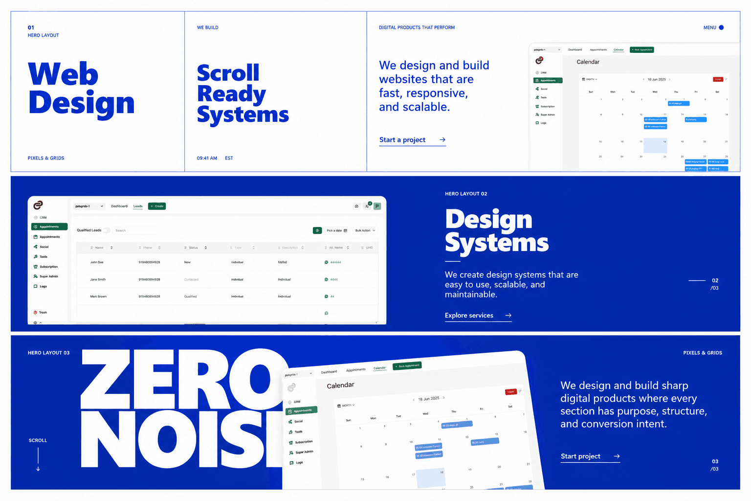
If you look at agencies like Cuberto, Active Theory, or many Awwwards winners, it's easy to think:
"Their animations make the website feel premium."
That isn't true.
Turn off every animation on those websites and they'll still look better than 95% of agency websites.
The real difference isn't GSAP, Three.js, or shaders.
It's layout composition.
This is one of the biggest lessons I've learned while studying premium agency websites.
Most Developers Think Like This
When building a landing page, the thought process usually is:
Navbar
↓
Hero
↓
Services
↓
Projects
↓
Testimonials
↓
CTA
↓
Footer
That's thinking in components.
Premium designers don't think in components.
They think in experiences.
Think In Sections, Not Components
Instead of asking
"What component should I build?"
Ask
"What should the visitor feel in this section?"
Every section should have one clear purpose.
For example:
Section
Emotion
Hero
Wow
Capabilities
Confidence
Gallery
Proof
Process
Trust
CTA
Action
That's storytelling.
Every Section Needs One Hero
A common mistake is giving everything equal importance.
Heading
Paragraph
Button
Image
Cards
Nothing stands out.
Instead, every section should have one dominant element.
It could be:
- Huge typography
- A large product screenshot
- A bold statement
- A striking visual
Everything else supports that hero.
Master White Space
Beginners hate empty space.
Premium designers love it.
Compare these:
Bad
Heading
Paragraph
Button
Better
Heading
Paragraph
Button
White space isn't empty.
It creates breathing room.
It tells the user where to look.
Typography Creates Hierarchy
Many websites use too many font sizes.
36px
32px
28px
24px
22px
20px
18px
This creates visual noise.
Instead, exaggerate the contrast.
160px
24px
14px
Premium websites often use massive headlines and very restrained supporting text.
Visual Weight
Every element has weight.
Imagine three objects.
██████████
████
██
Your eye naturally looks at the biggest object first.
Your layout should work the same way.
Usually:
- Heading = Heavy
- Screenshot = Heavy
- Paragraph = Medium
- Labels = Light
If everything is equally bold, nothing is important.
Build Using Grids
Premium layouts rarely feel random.
They're built on grids.
Example:
|---------|----------------------|
Title Product Screenshot
Text Image
Button
|---------|----------------------|
Even when elements overlap, there's almost always a hidden grid underneath.
Break The Grid Intentionally
This is where premium websites become memorable.
Instead of everything aligning perfectly:
Heading
Paragraph
Image
Break one rule.
Examples:
- Image overlaps the heading
- Text extends outside the container
- Screenshot rotates slightly
- Large typography gets clipped by the viewport
The key word is intentional.
Layer Everything
A premium layout isn't just text and images.
It's layers.
Large Heading
Grid Lines
Screenshot
Small Labels
Section Number
Background Texture
These subtle layers create depth without adding clutter.
Rhythm Is More Important Than Spacing
Many websites use identical spacing between every section.
Hero
80px
Cards
80px
Gallery
80px
CTA
Premium websites vary the rhythm.
Hero
↓
↓
↓
Cards
↓
Gallery
↓
↓
↓
↓
Sticky Section
↓
CTA
Some moments breathe.
Others move quickly.
That rhythm keeps the page interesting.
Every Section Needs A Surprise
One mistake many portfolios make is repeating the same interaction.
Instead, every section should introduce one new idea.
Example:
Hero
Huge editorial typography.
Capabilities
Interactive hover cards.
Gallery
Horizontal scrolling.
Services
Sticky content with changing visuals.
Projects
Cursor-follow preview.
Process
Timeline animation.
Every section becomes memorable because it offers something different.
Motion Comes Last
This surprised me the most.
The order should be:
Structure
Layout
Typography
Spacing
Color
Imagery
Interactions
Animations
Most beginners start at step eight.
Premium studios start at step one.
My Framework For Premium Landing Pages
Whenever I build a website now, I follow this structure:
Hero
↓
Capability Cards
↓
Horizontal Gallery
↓
Sticky Story Section
↓
Projects
↓
Process
↓
Stats
↓
CTA
Each section has one clear purpose.
Each introduces one new interaction.
Each builds confidence.
Final Thoughts
Animations don't make websites feel premium.
Layout does.
Motion simply enhances a great layout.
The best agency websites aren't collections of beautiful components.
They're carefully composed experiences where every section has a purpose, every element has hierarchy, and every interaction feels intentional.
That's the mindset I'm now practicing every time I design a landing page.
Series: Creative Development Notes #1 – Learning Layout Before Motion